

BRAND & WEBsite DESIGN client
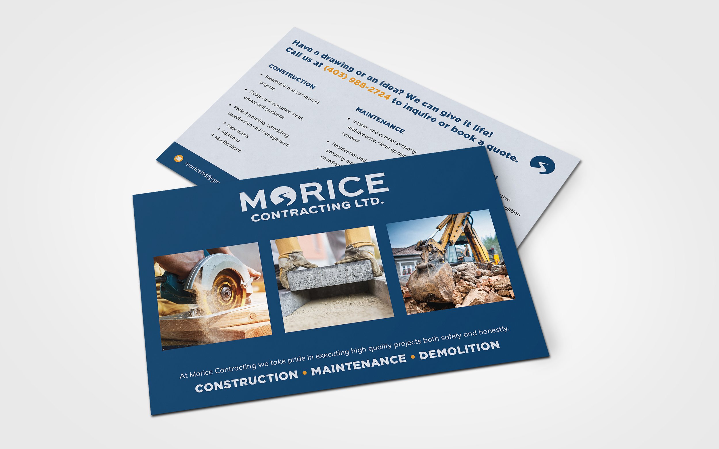
Morice Contracting
Morice, a Calgary-based company, prides itself on achieving balance in business, client relationships, and the environments it engages with during projects. With extensive experience in commercial and industrial construction and a meticulous approach, Morice ensures its customers experience unmatched honesty, safety, and quality.

BEHIND THE BRAND
We don’t think of our projects as work, but instead as a valuable relationship.
The Morice brand draws inspiration from the Morice River, where the founder’s family fished for generations. Using negative space to craft an image and tell a story, the river icon within the letter “O” honors the company’s family history while adding a friendly, approachable element to the logo. This thoughtful design reflects the detailed and collaborative approach Morice Contracting takes with its clients. The use of a clean, bold sans serif typeface conveys the company’s commitment to high-quality services, with the strong letterforms symbolizing reliability and honesty.


Professional
High Quality
Reliable
Detailed
Honest
Friendly


“Tegan’s expertise and passion for design gave me confidence throughout the branding and website project. Her ability to guide me with clarity and a genuine approach made the entire process seamless and professional.”
— Travis, Owner
BEHIND THE website
We want clients to feel confident before they inquire for a quote.
The Morice website was designed to provide visitors with a clear sense of the professional, reliable, and honest experience they can expect when working with Morice on custom projects. To achieve this, the site features straightforward, easy-to-navigate sections that highlight the company’s values, share the story behind its name, and include a comprehensive FAQ section to address common questions upfront. This simple yet effective layout ensures an engaging and informative experience for all users.

